CITY LINES
Nebraska Architecture Poster Series
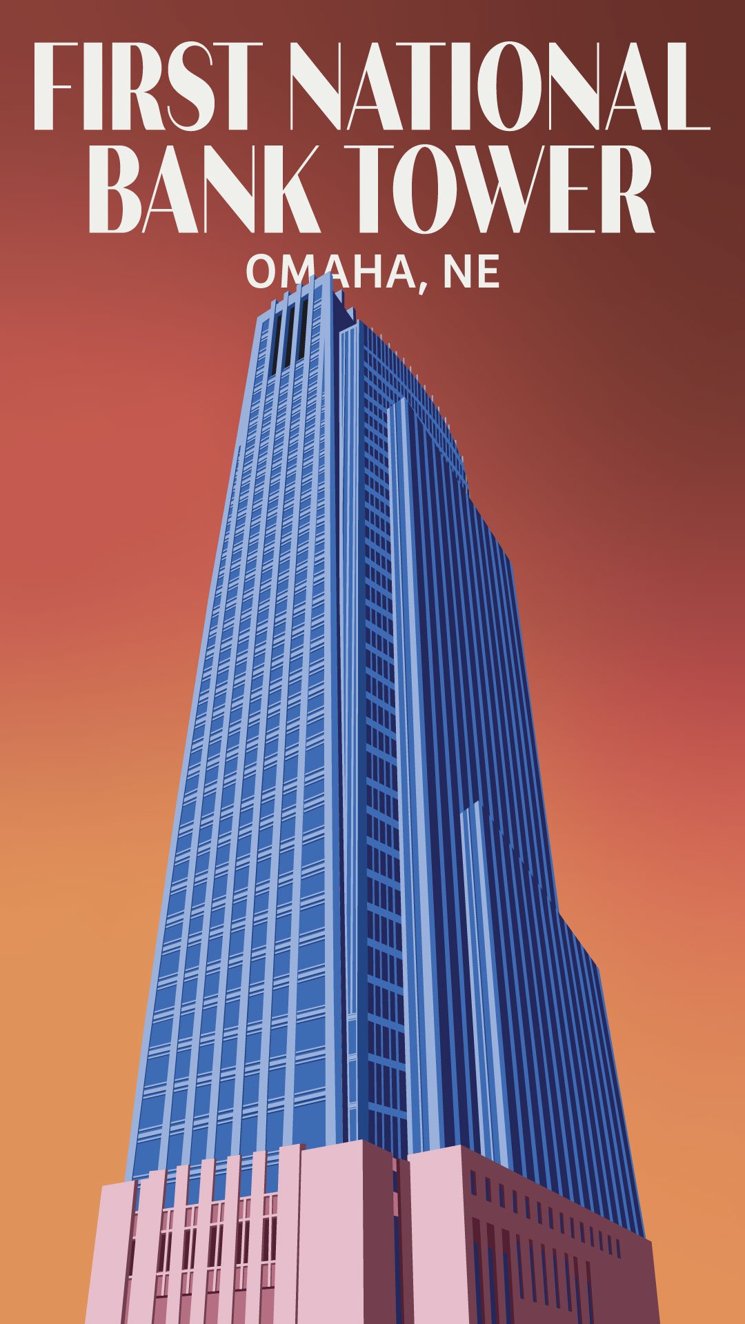
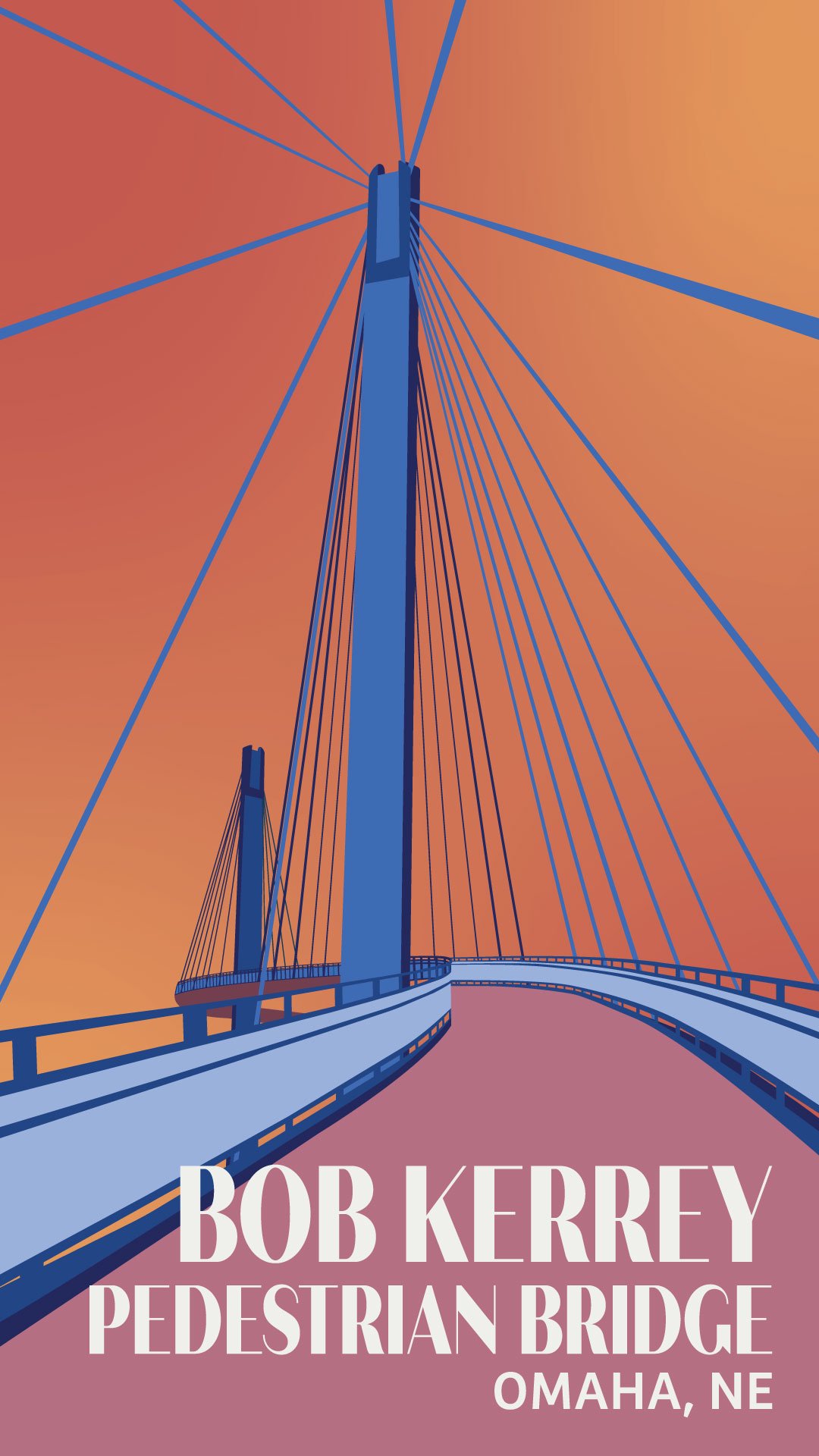
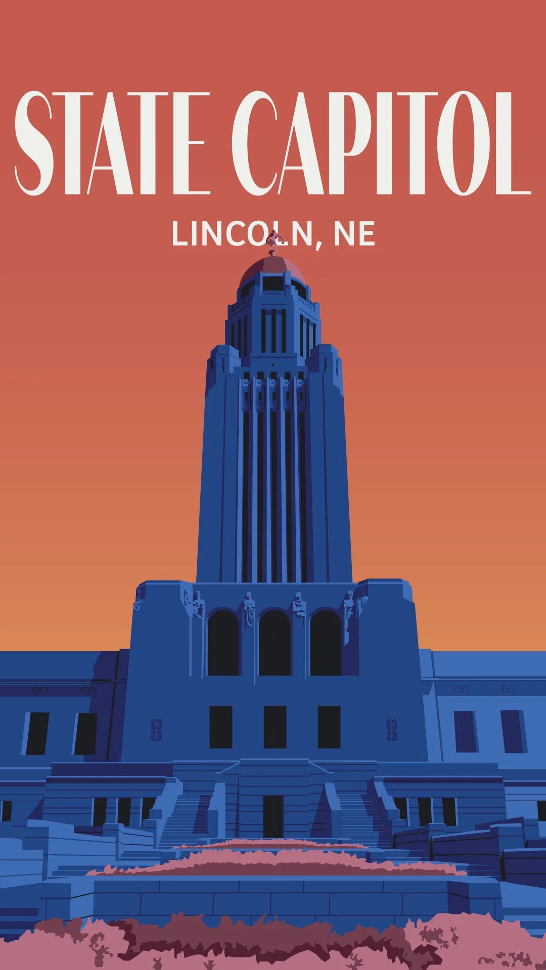
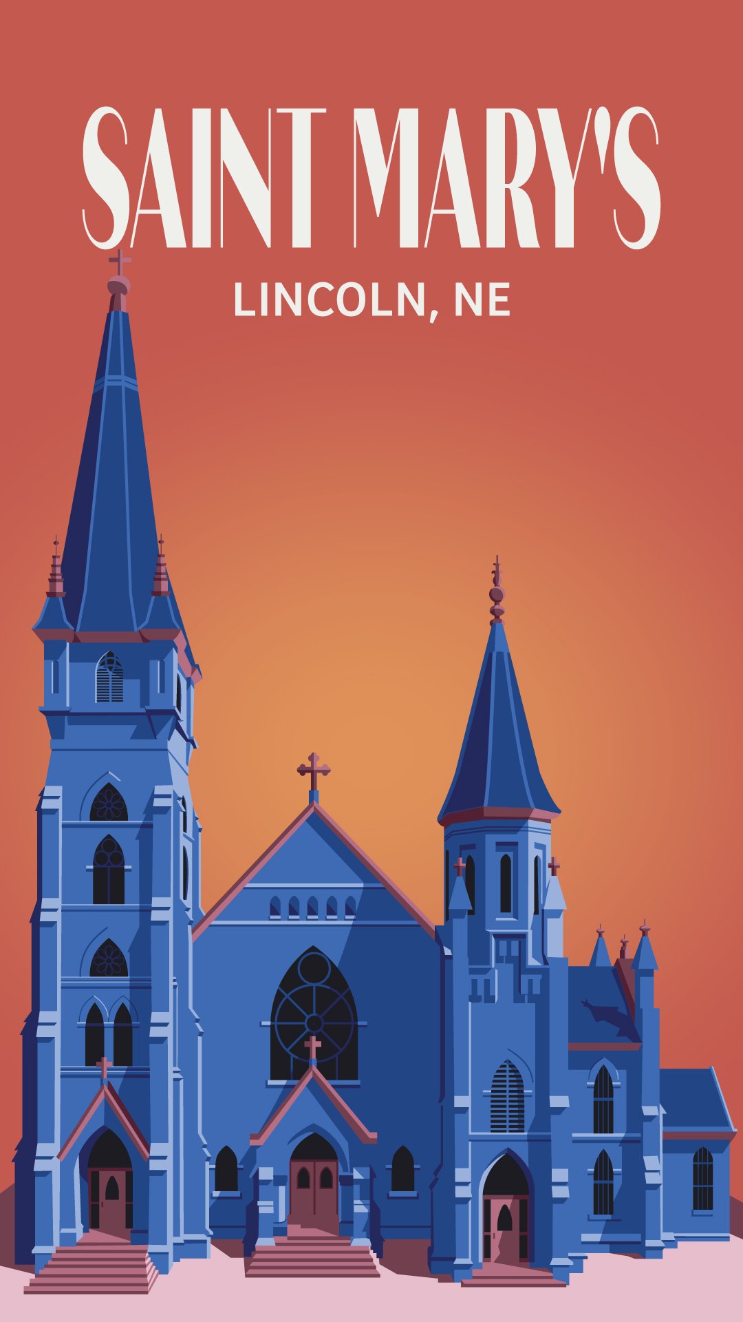
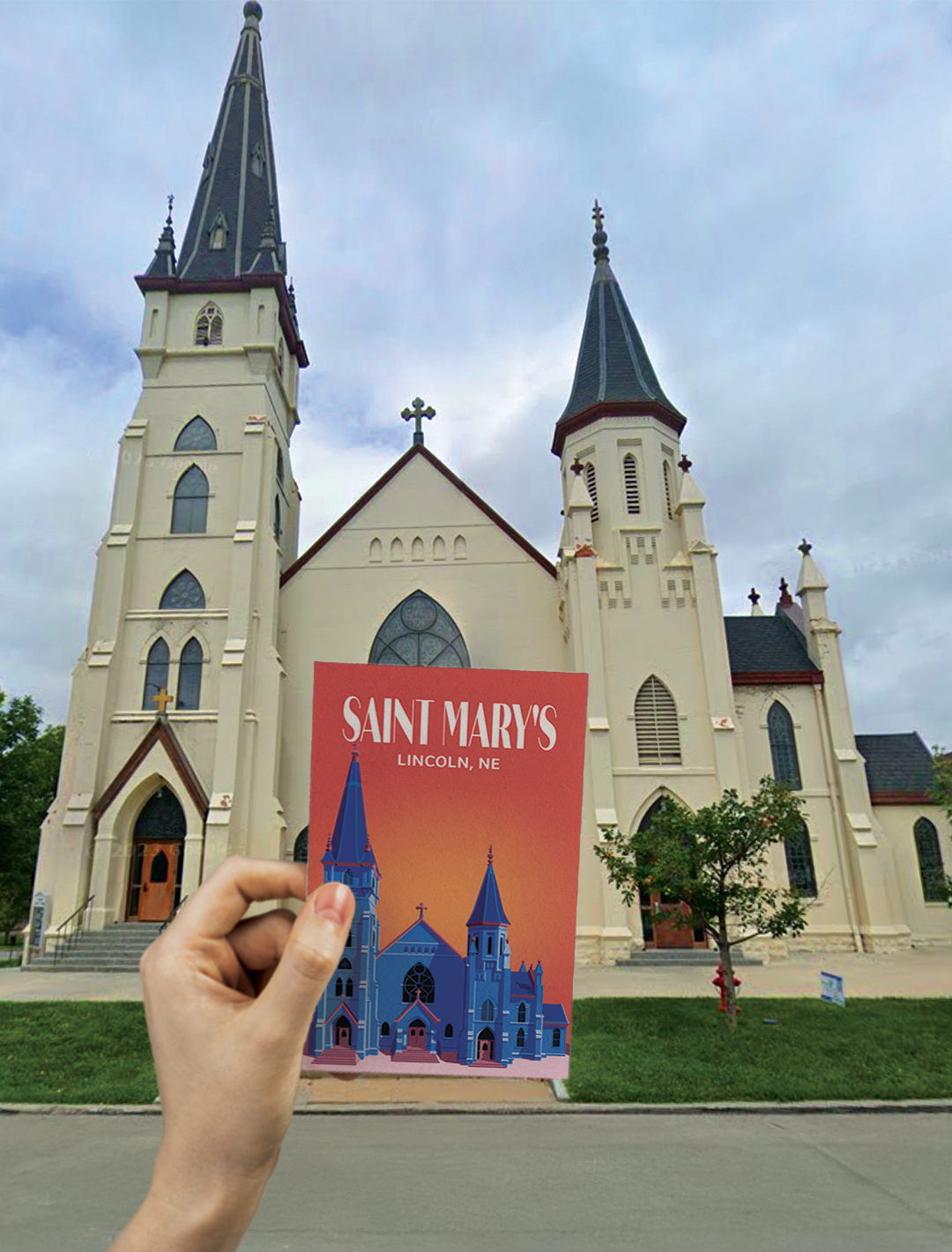
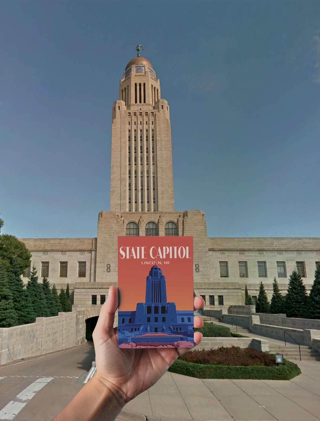
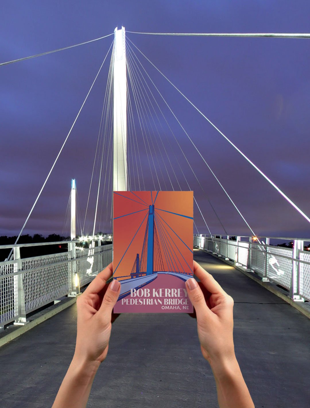
This project features a series of illustrative posters celebrating the architectural identities of Omaha and Lincoln, Nebraska. Through research and visual exploration, I captured the contrast between Omaha’s bold, modern structures and Lincoln’s more traditional, historic architecture. I began by developing a mood board and sketching concepts inspired by key landmarks from both cities. Each poster was thoughtfully composed with detailed elements to create a unified visual language. After receiving and integrating feedback, the final set showcases a cohesive series that highlights the architectural diversity of Nebraska’s two most iconic cities.
SCOPE
Architectural
Illustrative
Contrasting
Cohesive
For this project, I selected a rich and balanced color palette that includes warm earth tones and cool blues and purples. These colors are used consistently across all the posters to create visual harmony and unify the series as a whole. The chosen typefaces—Quiche Sans, with its elegant, high-contrast forms, and Bree, a clean and modern sans serif—complement each other by balancing sophistication with clarity, supporting the architectural theme with a refined yet approachable feel.